Hi, Class.
I found the examples of this assignment I have are all from ILL625, the graduate course "Drawing from the Imagination." So bear in mind that these are the work of graduate students.
The first example won an A, I think, not for being free of error, which it isn't, but for being so well-planned, thorough and logical with the shadows.
So what's where's the error? For starters he put the sun too close to the VP, which made the shadows very long across the faces of the buildings and caused him a couple problems. For a detailed analysis of this one, see my
blog for ILL625. It will help you a lot with our current assignment.
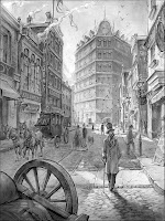
The second examples was by a fellow named Chad, the finest artist ever to come through my online sections. There was one subtle thing wrong, and a lot of pluses. The pluses were the addition of four extra vanishing points(!!), atmospheric perspective (the way the farther things are lighter and less contrasty, especially closer to the dusty street, to give an added sense or air and depth). The wrong thing? There should really be soft, faint "puddles" of shadow under big things like the coach and horses, made by the scattered light coming down, not directly from the sun, but from the sky.
If you look closely, you can see that he subtly used some digitally set type on a couple of the signs on the left side of the street. My hat's off...
JH


 The second examples was by a fellow named Chad, the finest artist ever to come through my online sections. There was one subtle thing wrong, and a lot of pluses. The pluses were the addition of four extra vanishing points(!!), atmospheric perspective (the way the farther things are lighter and less contrasty, especially closer to the dusty street, to give an added sense or air and depth). The wrong thing? There should really be soft, faint "puddles" of shadow under big things like the coach and horses, made by the scattered light coming down, not directly from the sun, but from the sky.

